Business intelligence dashboards can come in all different forms and cover a variety of topics based on the industry. With a growing number of chart types and more and more data being visualized, the possibilities of how the data can be displayed and the stories they can tell us are endless.
Below are some dashboards that provide insights on everything from tracking sales to understanding crime patterns in India. Each one is interactive which gives you, the consumer of the dashboard, the opportunity to ask and answer your own questions.
1. AAPL Ticker
Explore this viz by Yuri Fal to track Apple (APPL) stock over the years. Tracking the stock only tells a part of the story. It's also interesting to see what events took place, and what their impact on the stock was. By clicking on the dots, you can see how a product release or the end of quarter filing played a part on Apple's stock performance.

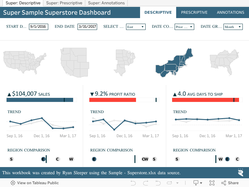
2. Super Sample Superstore Dashboard
This corporate style visualization is a different take on the classic Tableau Superstore data set. Quickly spot increases or decreases in sales, profit ratio, and shipping time, and switch to the Prescriptive tab to pinpoint the root cause. Created by Ryan Sleeper, this workbook aims to train users on design, data visualization strategy, and how to use Tableau to get the most out of any data set.
3. Healthcare data
Explore patient demographics and trends by department in this visualization (viz) by Bridget Cogley. This viz uses Tableau's clustering feature to uncover insights in hospital data, identifying frequent short-stay patients compared to extended-stay patients.

Create beautiful visualizations with your data.

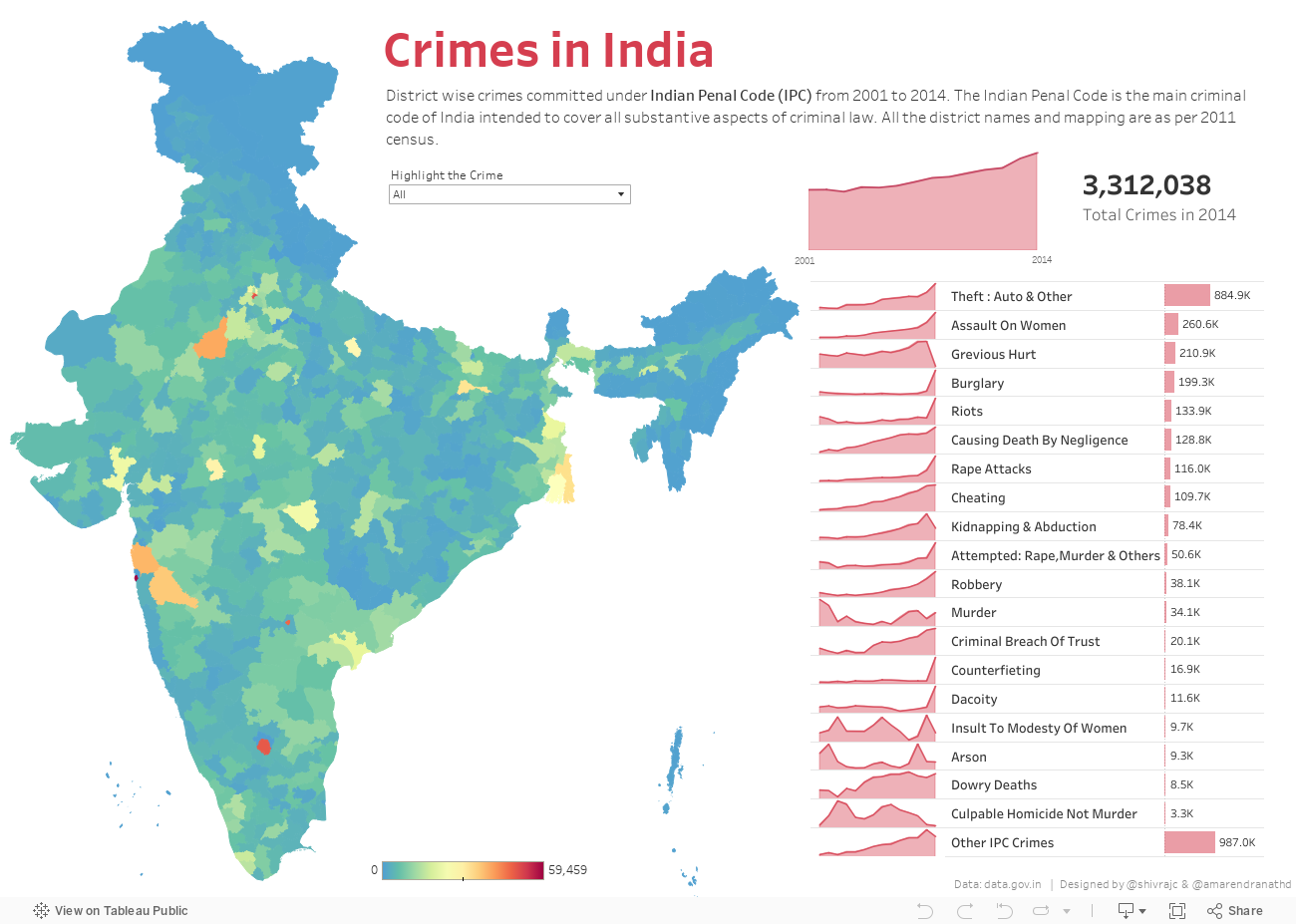
4. Crimes in India
This dashboard by Amarendranath Donthala uses a map to show where various crimes were committed under Indian Penal Code from 2001 to 2014. Explore the dashboard to see the districts that had the most crime and the types of crime that were most prevalent during that time period.
5. Global Market Overview
Explore this dashboard by Boeing to understand the Fortune 100 company's forecasts for airplane demand over the next 20 years. By utilizing 10 different chart types, the viz audience can see a different perspective and discover new insights.
Navigate through all four tabs to view the full analysis and hover over different charts for more detail.

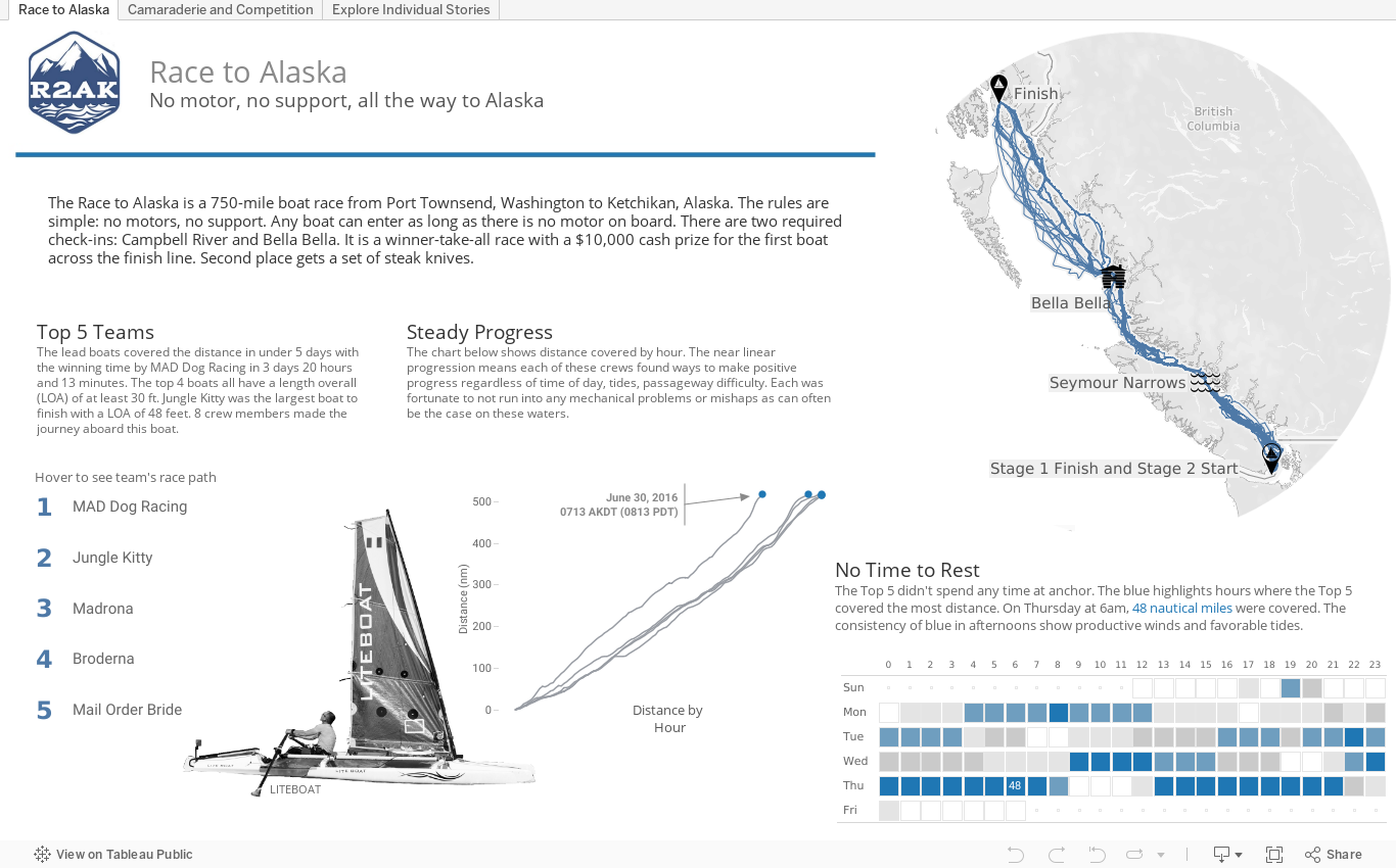
6. Race to Alaska
Anthony Gould visualizes the itinerary of the top 5 teams in the Race to Alaska, a 750-mile (1,207 km) boat race starting in the North of the State of Washington.
Hover over a team's name to see their itinerary and speed during the race. The heat map like chart at the bottom right shows the fastest hours of the top 5 teams.
For more dashboard examples, check out the Tableau viz gallery or explore how companies of all sizes use Tableau to get the most out of their business intelligence dashboards.